Enduringly, mergers and acquisitions represent extraordinary opportunities to create value. They also come with unique challenges. Leaders must navigate these leaps while managing the changing expectations of their customers and talent, and while balancing innovation with continuity and security. Brand strategy will play a pivotal role in their success—with design one of the most powerful tools they can use to build toward a unified future.
From day one of the complex interim phase post-merger, there are many ways leaders can engage key audiences strategically via design—like using unified branding on merger communications to attract investors while featuring endorsement lockups in website headers to reassure customers of continuity. Thoughtful design aligns internal teams, reassures external audiences and projects a unified vision across every touchpoint and interaction.
In the best cases, the combined organization’s new visual identity signals its promise effectively, conveying both its enduring strengths and pure growth potential. But businesses can also make mistakes. Inadvertently, they can miss valuable opportunities to communicate clarity, unity and confidence to the people that matter most.
The following examples illustrate how different B2B brands have approached their logo designs post-merger. Some created more cohesion than others with this vital, foundational brand asset. But each story offers valuable insights for leaders with their own M&A branding initiatives ahead.
The Isolated Alliance
Chemical giants Dow and DuPont merged in 2017, becoming DowDuPont. Each came with an iconic and instantly recognizable identity. Leadership knew replacing them would be a formidable task…so they didn’t. Instead, they chose to create a single lockup that placed the existing logos side by side, with one trademark symbol uniting them.
Some of this strategy was practical. The entity was always designed to be temporary, and in fact completed its spin offs in June 2019 and has ceased to exist. However, by retaining the two original logos—and keeping the businesses at arm’s length—DowDuPont did not build confidence in its highly complementary portfolios. In fact, in the years that lapsed between the merger and the actual spin offs, the company lost more than $40 billion in value, “confounding” its leadership’s expectations for growth.
Of course, much of this loss of value can be attributed to business context and operational mis-steps. But the company’s logo treatment serves as a visual representation of potential synergies unrealized. Other mergers of equals did not feature this approach. For instance, ConocoPhillips—a merged company that chose a similar naming strategy—opted for a new, combined logo that conveyed, at a glance, an integrated and unified entity.
The Compromise
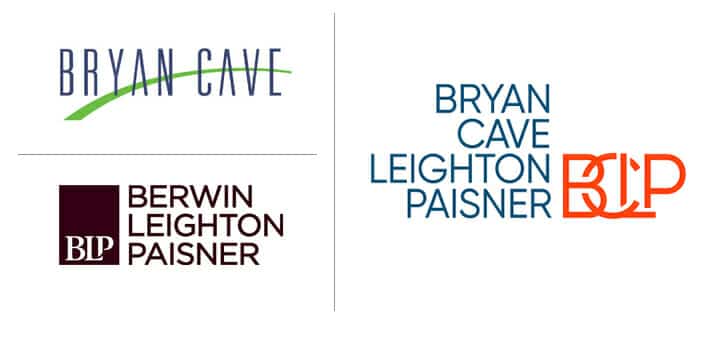
In 2018, American Big Law firm Bryan Cave merged with British-based Berwin Leighton Paisner in order to increase its international reach. Its rename and corresponding logo change largely conformed to legal industry M&A norms; it created a firm whose name was a longer list of surnames: Bryan Cave Leighton Paisner (BCLP).
Perhaps as a consolation prize for the loss of “Berwin,” the new logo design echoes that of Berwin Leighton Paisner, consisting of stacked names paired with a monogram of overlapping letters. However, unlike the original Berwin Leighton Paisner, which placed the monogram in a brown bar that spanned and united the list of stacked names, the BCLP monogram is placed in white space, allowing the “Bryan Cave” part of its name to stand alone.
All in all, the new logo and name suggest that although some conciliatory moves have been made to incorporate the Berwin Leighton Paisner brand and culture, the Bryan Cave brand was dominant.
There is nothing inherently wrong with this. When one company is significantly larger or more well-known than the other, the approach is coming. But this strategy is bound to ruffle some feathers.
The creation of BCLP was not without stumbling blocks, as many former Berwin Leighton Paisner partners left, particularly those in Asia—foiling some of BCLP’s international aspirations. Once again, we see how a brand identity can suggest potential consolidation challenges. In this case, the intended dominance of the Bryan Cave brand may have called for greater cultural alignment initiatives among Berwin Leighton Paisner employees.
The Transformation
The 2016 merger of IMS Health and Quintiles created a market-leading provider of both health information technologies and clinical research. To symbolize the company’s category-smashing consolidation, leadership knew they wanted a brand-new name and logo. However, they were also careful not to upset employees or customers by rushing the change. Instead of moving quickly, leadership wisely embarked on a transitioned transformation that built essential confidence and trust.
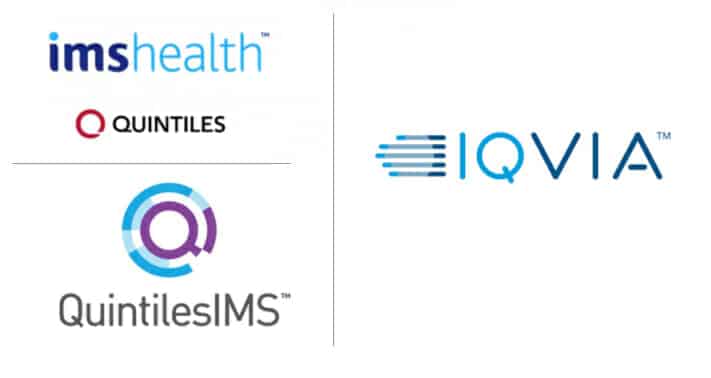
The business first rebranded as QuintilesIMS, adopting a temporary merger logo that combined the Quintiles Q with IMS Health’s blue color palette. A short time later, when internal and external acceptance of the merger was high, the company took on a more radical rebrand. It changed its name to IQVIA, pronounced Eye-Q-via, which contains a nod to the “I” of IMS and the “Q” of Quintiles, but in a completely fresh way.
In its logo, the business retains the IMS color palette. But by treating IQ and VIA in different shades of blue, the logo emphasizes that the combination offers success “via” a new path. The new typography is light and modern, and the logo’s graphic is reminiscent of both data visualization and forward movement.
IQVIA’s careful transformation cost it time and money. Leadership had to introduce not one but two name and logo changes. But for this company, the more involved strategy ultimately paid off. The company experienced positive financial performance and reported double-digit growth in real-world business.
Brand Merger Logos: More Than Skin Deep
As these examples show, brand identity post-merger is far more than an exercise in aesthetics. A logo alone carries weight. It represents the strategic vision, cultural alignment and operational priorities of the newly combined organization. Whether signaling a temporary alliance, navigating a cultural compromise or driving a complete transformation, design choices shape perceptions, build trust and accelerate the realization of a merger’s full potential.
When approached strategically, visual identity becomes one of the most impactful tools for post-merger success. It communicates clarity and confidence to every audience, aligns internal teams under a shared purpose, and ensures external stakeholders see both stability and exciting potential on the horizon.
With thoughtful design as a guiding force, leaders can turn moments of change into opportunities to demonstrate strength, unity and forward momentum—laying the foundation for enduring value creation.
To discuss rethinking your brand identity after a merger, contact us.


