Subscribe to Our Newsletter
For technology companies, translating a sophisticated offering into an easy-to-grasp value proposition can be a major challenge. It’s even trickier when the business undergoes merger and acquisition activity and needs to integrate many entities into a single, coherent brand—while concisely communicating the unique qualities of all underlying solutions.
DeSantis Breindel client e2open, a world leader in supply chain management software, had acquired several smaller software providers when they came to us looking to rebrand. The aftermath of the global pandemic, which brought an unusual level of attention to global supply chains, added a sense of urgency. It was a hyper-visible time to debut a new post-M&A brand in their space.
A purpose-led brand
Rather than focusing on the technology itself, e2open’s new brand established cohesion by focusing on the company’s purpose. It positioned supply chains as the lifeblood of commerce; without them, we couldn’t make, move, sell or purchase goods and services all over the world.
The new brand underscores the interconnectedness of all supply chain participants and highlights e2open’s role in harmonizing their interactions. With this harmonization, customers can be empowered to anticipate any disruptions and find opportunities to improve efficiency, drive profitability, reduce waste and operate more sustainably.
The brand crystalizes in a powerful, unifying statement: Moving as One.
Finding the visual white space
In translating a complex technology solution into an intelligible brand promise, it’s not only important to get the language right. It’s also vital to create a design language that conveys simplicity without dumbing down the underlying solution.
We began our visual brand exploration by conducting a thorough audit of the company’s vast array of existing communications materials. This audit only reinforced the need for a more cohesive, consistent brand.
We also took a comprehensive look at competitors, analyzing each brand in terms of messaging, color palette, photographic style and overall tone. This analysis uncovered competitive “white space” where a new e2open brand could stand out.
Avoiding guesswork
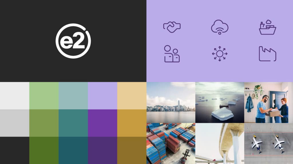
To emphasize simplicity and clarity—two fundamental components of the company’s value proposition—we replaced the company’s existing logo with a streamlined wordmark. Eschewing guesswork, we tested a range of logo options with a group of influential external supply chain operators, strategists, C-suite executives and others across manufacturing, logistics/distribution and retail/channel businesses before landing on the final word mark.

A standout design language
e2open’s new color palette is dynamic and multifaced, like the company itself.
The new photographic style uses bright, even slightly over-exposed images to underscore the idea of transparency. Avoiding typical supply chain images of container ships and railcars, e2open’s photographs focus on specific moments in the dynamic movement of products around the globe, emphasizing the human element to provide a sense of warmth and authenticity.
Even e2open’s bespoke system of icons was designed to highlight openness. The new icons are not made up of closed outlines but instead feature openings that suggest visibility and insight.

A modern, connected approach
e2open’s new brand was unveiled externally at the Gartner Supply Chain Symposium/Xpo™ 2022. It was also rolled out in new campaigns launched across print and digital mediums, as well as on the company’s website and social channels.
According to e2open’s CMO Kari Janavitz, “The brand refresh is an acknowledgment of the world we live in and signals the need for a modern, connected approach to supply chain.”
Marketplace responses and feedback affirm the new brand is achieving its goal: bringing clarity and cohesion to the company’s unified work after multiple acquisitions.


