Subscribe to Our Newsletter
Millennials, now in positions of influence across markets, have redefined the design look and feel of B2B branding. What is the millennial aesthetic, and could it help your business connect more powerfully with today’s stakeholders? Let’s dive into understanding this fascinating design trend and what it could mean for your next B2B brand strategy.
In early March 2020, New York magazine published the article “The Tyranny of Terrazzo: Will the millennial aesthetic ever end?” Its author, Molly Fischer, describes the trend’s look this way: “It aims its appeal at everyone…. Simplicity of design encourages an impression that all errors and artifice have fallen away.” She points to brands such as Glossier, Thinx underwear—even politician Elizabeth Warren—as exemplars of the trend, which embraces clean lines, soft neutral colors with cool accents, white space and bespoke illustration and photography. Think millennial pink and Instagram-friendly, like the Museum of Ice Cream.
The millennial design aesthetic may have already crested in B2C markets. (We see top consumer brands shifting their focus to Gen Z.) But B2B implementations now seem to be everywhere, and it makes sense: as millennials age (the oldest are now over 40, with the youngest in their late 20s), they’re losing their status as primary targets in certain consumer categories. At the same time, they’re surging to prominence in their professional lives, including in the B2B marketplace.
Millennials are now serving in mid-level to senior business positions where they influence—if not personally make—the largest B2B purchase decisions. It’s no surprise this generation’s preferred consumer brand aesthetic and design language followed them into their B2B stakeholder worlds.
The Millennial-friendly Design Trends within B2B Branding
How can you spot the millennial design trend? Here are five of its primary characteristics:
Design Trend 1: Soft, Organic Color Palettes
When we think of the average B2B brand, we often associate it with “corporate blue.” A B2B brand design usually seeks to convey authority and expertise, and until recently, that often meant using conservative colors like corporate blue or forest green, with maybe an accent color or two.
In more “aggressive” fields like cybersecurity or litigation, we sometimes saw brands choosing brighter hues to signal their status as innovators and status-quo challengers. But it’s been a rare B2B brand that picked magenta or turquoise as its signature hue, let alone pink.
Enter the millennials. These buyers value authenticity and personality. They want brands to look unique, but not in an attention-seeking way. So their design choices tend to gravitate toward soft, organic colors like “succulent green,” “rose gold” and “periwinkle grey.”
Take a look at Zendesk. The company, which sells customer service and CRM software, used to have a crisp (if unremarkable) website that positioned them comfortably within B2B branding conventions for the tech space. More recently, they went straight for millennial pink with accent colors of deep aquamarine and ochre:
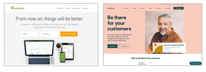
The Zendesk brand has seen some updates since that first bold transformation. But to this day, it remains a prime example of millennial-friendly brand design.
Design Trend 2: Illustration
Business publications have written plenty about millennials’ desire for authentic, human brands. We explored this trend a few years back and noted that its rise is understandable. After all, in a world where false stories can derail political conversations and Instagram stars can turn out to be imposters, why wouldn’t audiences grow cynical?
Many B2B brands have responded to millennials’ desire for authenticity with more conversational text, behind-the-scenes videos, employee blogs and immersive events. Increasingly, we also see their efforts reflected in the imagery they choose for corporate communications. Stock photos of generic businesspeople in bland offices are definitely out. So what’s taking their place?
Some brands are commissioning their own photography to ensure their images are unique (and proprietary). For example, Guggenheim Partners hired a photojournalist to document its people in action, ultimately creating a vast image bank for marketing collateral. This strategy may not work for every company, however. Commissioned photos can age quickly (featured talent may resign, office spaces may be renovated, etc.). Photographers can be expensive. It may also be difficult to shoot photography effectively and/or safely in some work environments.
Savvy brands—taking a page from millennial-friendly consumer brands—started opting for custom illustrations instead of photos. These fun, approachable visuals can help brands pass the same authenticity tests, building on millennials’ affinity for approachable hand-lettering and other bespoke illustration hallmarks.
Even sturdy conservative brands like IBM have used illustrations to tell compelling customer stories, visualizing their solutions and the results they achieve:
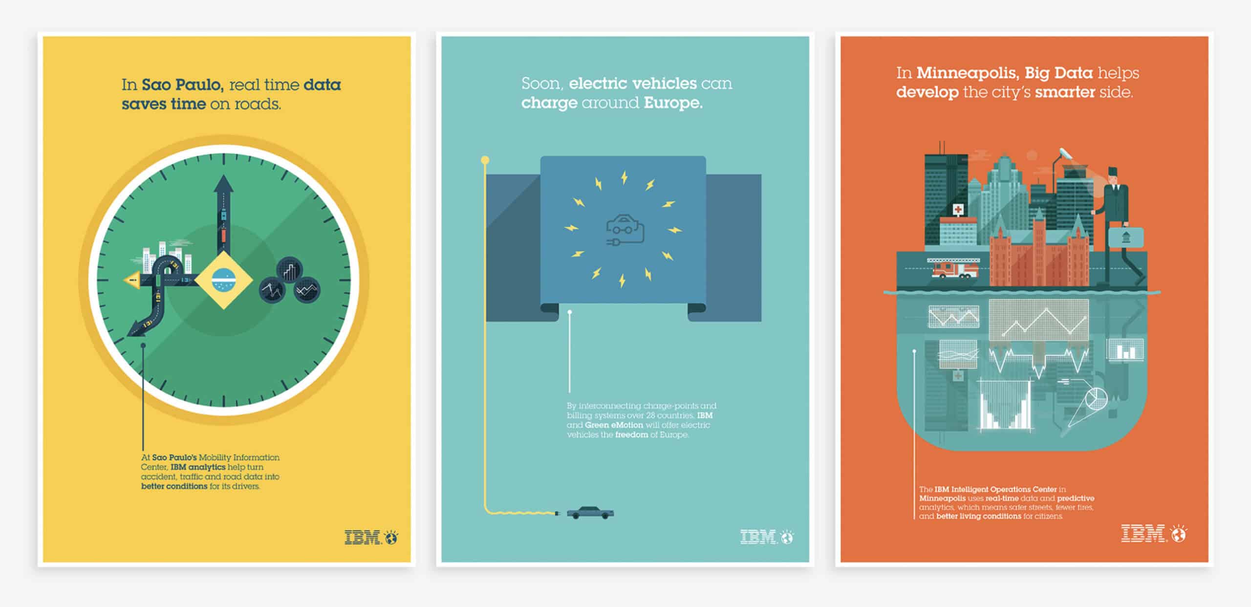
While many of the first B2B companies to use illustrations were also in the tech space (think Salesforce, Dropbox or Slack), we’ve watched this strategy spread across markets in recent years. More and more brands are also developing custom iconography systems. Insurance giant Chubb, for example, differentiates its many lines of business with a set of colorful icons that are robust and colorful.
Design Trend 3: Sans-serif Typography
Serif typefaces have long been used to lend a brand gravitas, exclusivity and authority. In the fashion industry, high-end brands like Ralph Lauren and Tiffany & Co. always used serif fonts—until now. Recently, a surprising number of luxury brands have introduced new, simplified sans serif wordmarks, among them Burberry, Balmain and Saint Laurent:
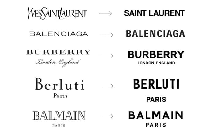
Could the same branding design trend be coming to B2B industries? In the past, many B2B companies doubled down on serif fonts that communicated their expertise and experience. Think of prestigious brands with proud legacies like McKinsey & Company, Goldman Sachs, J.P. Morgan, even Yale and Harvard.
Following fashion’s lead, however, B2B power players like BCG, HSBC and AmLaw 100 firm Seyfarth Shaw have transitioned to using sans-serif wordmarks, with Bristol Myers Squibb even embracing millennial pink while making the switch:
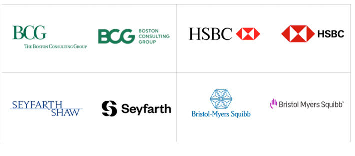
For many brands, what drives this change is what designer Peter Saville calls “modern utility.” Sans-serif fonts are easier to reproduce, whether on a designer jacket or onscreen. Their simplicity also aligns with millennials’ preference for cleaner lines.
In B2B industries, sans serif fonts can also play a uniquely humanizing role, particularly when a brand’s typeface style is light and open. They subtly suggest that a company is friendly and flexible (rather than stuffy and rigid), and that’s the kind of partner millennials hope to find.
Design Trend 4: Motion Graphics
Millennial-friendly design and compelling copy can’t create value if customers don’t pause to take it all in and read. It’s a well-known challenge when marketing to millennials: they are notoriously selective with their attention.
Motion graphics on a website help B2B brands meet the challenge of engaging millennials in multiple ways. They guide the visitor’s gaze toward high-priority content. They also enrich the online experience by adding more texture and energy. When your B2B role requires you to stare at detailed copy all day, motion can rejuvenate the mind.
One of the most well-known applications of motion graphics is Apple’s web page for the Mac Pro. As the website visitor scrolls, the animation begins, sleekly exhibiting the features that make such a pricey investment worthwhile. Visually stunning, the movement commands attention, delighting prospective buyers along their journey through product specs and information. Unsurprisingly, these motion graphics keep visitors on the site longer, helping boost conversion rates.
Motion graphics from online file storage solution Dropbox combine multiple design trends in a single animation. We see users’ smiling faces in social bubbles, abstract photographs that flirt with being illustrations (note the backgrounds in soft millennial design hues) and symbols for different file types on the move, signaling productivity:
Zendesk provides another good example. Its motion graphics are subtle: start scrolling and the site zooms in on the photograph you’re viewing; hover and it demos a solution for you. These graphics underscore the brand’s playful spirit even as they attract attention. For example, Zendesk uses a whimsical film clip—“dancing” odds and ends—as a background to introduce its Sunshine CRM platform.
Design Trend 5: Ultra-minimalism in Web Design
Millennials like things clean and simple. They love VOSS water, Method soap, Muji pens and Uniqlo basics. Accordingly, many B2C brands have gone ultra-minimalist with their website designs. Check out the sites for Herschel Supply, Brooklinen or Canadian furniture maker EQ3.
Adopting minimalist branding design can be more difficult for B2B websites, however. While e-commerce retailers can primarily rely on photography to showcase their products, B2B offerings require more explanation and demonstration. This requires B2B websites to incorporate far more text, with fewer opportunities for the brand to leave clean, simple white space.
Nonetheless, we’re seeing an overall trend toward more stripped-down B2B web design, particularly when it comes to home pages.
Visitors to the website for data-visualization firm Quid are greeted with a quick animation. The face of a poised, determined woman is framed by the brand’s signature “Q,” which the viewer travels through. The home page then presents the same woman in her wider context with the simple call to action “See Around the Corner,” inviting customers to benefit from the company’s insights:
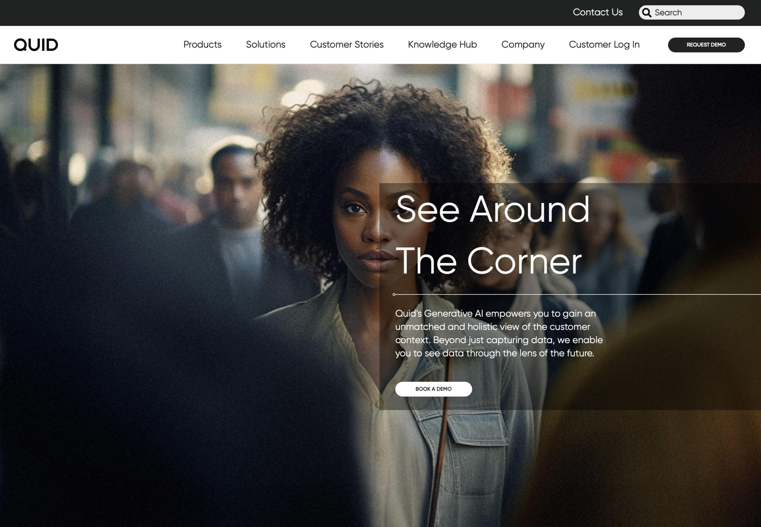
While other pages are more information-laden (by necessity), Quid’s website preserves plenty of white space around its simple sans serif text and full screen images.
Codetasty.com offers another good example. The company, which provides integrated development environments, makes a simple, focused first impression with its minimalist brand design. Visitors see an open laptop screen surrounded by a purple field of subtly-animated blocks. There’s a concise bit of intro text and a simple call to action, giving the viewer a moment to settle in, confirm the business’s value prop is right for them and “get started.”
Millennial Mania: Should You Follow These B2B Design Trends?
Adopting the millennial design aesthetic comes with pros and cons:
On the positive side, millennial-friendly design can project a more human and welcoming presence to prospects and clients. Its simplicity, motion graphics and careful use of white space offer a refreshingly clean customer experience. That’s important when targeting this growing audience of B2B decision-makers who value authenticity, purpose and convenience.
However, companies may risk sacrificing visual differentiation by embracing this B2B design trend. As Molly Fischer voiced in the New York piece, seeing similar design across companies, industries and platforms can grow tiresome—and even confusing. Take a look at the three website landing pages below (all for customer messaging platforms). Are they sufficiently distinct from each other to be memorable, communicate unique values and offer a clearly different experience?
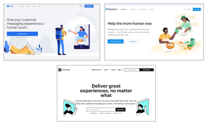
Ultimately, there’s no universal right answer on whether or not to adopt millennial design. If a company is a new entrant to a market—particularly in the tech space—embracing the aesthetic may bolster their credibility. (By adopting the design trends of an industry, a newcomer asserts its right to be there.) However, if you want to position your company as a market disruptor, conforming to conventions may not be the best strategy. A more unexpected design system could offer much-needed differentiation.
We expect the millennial design trend to continue shaping B2B branding. So bear in mind that your business’s decision to follow it or go in a different direction may change.
We’ll continue tracking the benefits and drawbacks of adopting millennial branding design and researching the situations and audiences for which it makes the most strategic sense. No matter which type of brand aesthetic a B2B company chooses, it’s most important to ensure they connect meaningfully with the stakeholders most vital to their business. That approach to brand strategy that will never go out of style.
To talk about what design strategy might be right for your B2B company, contact us.
Originally published May 27, 2020.


