Subscribe to Our Newsletter
“Disruption” is more than just a business buzzword or a marketing trend. For many organizations, it has become a true strategic mindset.
Companies jostling in crowded markets, as well as startups entering slow-moving industries, are searching for the fresh idea or novel business model that will shake up the status quo—and help them find the whitespace that they alone can credibly own.
Stake, a real-estate startup we partnered with, saw an opportunity to disrupt the home rental industry. The company knew that the existing system was at best outdated and at worst broken.
Landlords were losing money from frequent tenant turnover, leading to empty apartments and high acquisition costs to attract new renters—like first-month-free concessions, broker fees, and advertising initiatives. Those costs were being passed on to renters, who became trapped in an expensive cycle of steep monthly payments with no longterm gain.
Stake’s goal was to create a completely new model that benefitted both landlords and tenants. It would deliver efficiencies to property owners by filling units faster through its predictive analytics capabilities, and then pass along these savings to renters by investing a portion of their monthly payments in a real estate index—helping them earn a “return on rent.”
Such a groundbreaking idea needed an equally exciting identity to support it. So, as Stake’s branding agency, we were committed to helping it make its mark by focusing on three essential steps to build a truly disruptive brand fit for an industry trailblazer.
How to Build a Disruptive Brand
1. Prove authenticity through audience insights
Stake didn’t develop its “return on rent” idea simply to stand out in the category—it was answering a real need in the market. This was a critical distinction, one that had the power to shift consumers’ perceptions of the brand from being just another superfluous tech-based app to being a fundamental new service.
To incorporate this authenticity into the Stake brand, we began by exploring the key drivers that motivated its audiences, reviewing:
- Extensive qualitative market research Stake had already commissioned, including interviews with members of one of its most important target demographics: Millennials
- Secondary research sources: articles and studies from publications that had taken their own look at real estate trends and patterns
This information served as the foundation for the rest of our process, allowing us to construct a brand that not only felt true to the people it was serving, but that also felt credible and confident among competitors in the space—memorable, trustworthy qualities that were disruptive in and of themselves.
2. Search for the right story
Any company seeking to establish itself as a disruptive brand needs to have an engaging, distinctive story to rally consumers around.
In Stake’s case, we developed four different angles for communicating with customers. Each of these “territories” purposefully highlighted different aspects of the Stake offering—from its radical ability to democratize renting and real estate investment to its status as a smarter hybrid option between renting and owning.
In the end, Stake adopted a territory centered on ease, simplicity and positivity: “Renting made good. Investing made easy.” This concept became a lens that guided our development of Stake’s visual and verbal identity across all touchpoints, from investor decks to web copy.
Ultimately, such a straightforward and accessible positioning not only felt unique in the real estate industry. It enabled Stake to build trust with customers who may have otherwise been apprehensive of an entirely new renting model.
3. Make a statement with a striking look and feel
It’s not enough for disruptive brands like Stake to pioneer new approaches; they also have to look the part. To help Stake infuse the unconventional nature of its business into the brand, we developed a visual identity that made a lasting impression.
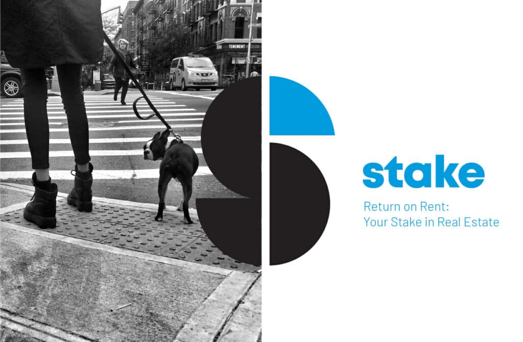
We started with the logo: a bold, mostly-black monogram “S” that represented the Stake moniker. With the colored tip of the “S” arranged next to a line of negative space that divides the logo, these pieces created a hidden flag—representing the literal stake that customers receive when a percentage of their rent is invested through the company.
Together with a friendly, lowercase wordmark, the elements of the Stake logo became approachable and self-assured.
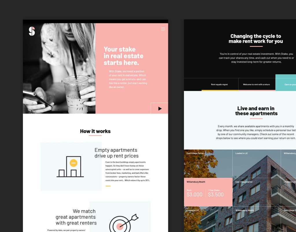
We worked to extend this personality to other areas of Stake’s look and feel as well, including its color palette and photography.
A collection of bright yet soft pastel shades marked a departure from more traditional real estate companies, conveying a playfulness that appealed to the younger renters Stake wanted to connect with.
These hues contrasted nicely with dramatic black-and-white lifestyle photography. Artistic, “in situ” shots of regular people in their everyday lives aligned with the ethos of the Stake brand—rejecting traditional stock imagery for real, genuine pictures that defy category convention.
Disruptive businesses call for disruptive branding. It’s an effective way to stay true to who you are, connect with the people who matter most to you, and stand out in categories crowded with established players.
So, use brand boldly to elevate your disruptor status and the unique value you bring to the world. For companies that challenge the way things have always been done, having a deep understanding of your audiences, a strong brand strategy, and impactful visuals can make a world of difference—and set you up for serious success.
Want to discuss building your disruptive brand? Let’s talk.
Originally published March 10, 2021.


